Limitations of Search

Entertainment
has a UX Crises
The experience of designing and creating Storymaker at Stupid Fun Club gave us a taste of a core problem faced by artists, publishers, developers, and marketers, especially in the era of streaming-access to any entertainment medium: Discovery.
Search had empowered the disruptions of the Internet, but had brought with it a cost to the minds of consumers. Finding content you had yet to learn about was not easier, it was harder.
We were disppointed by the grids and lists present in apps like iTunes, Netflix, and Spotify, and "radio-style" discovery, even if the recommendation algorithms were amazing, is still inefficient.
What is needed are new forms of search that support discovery and exploration with intuitive forms of guidance.
Stages of development of Mappable, showing the voronoi subdivisions used to manage placement of objects to support the generation of terrain.

iTunes, to us, represented the target market. Unlike Spotify, Apple already had a built in subscriber base with its products, integrating its user accounts with iTunes, managing devices and backups, and offering free content now and then to increase usage.
The UX was purely mechanical, like flipping through an alphabetically sorted catalog and with none of the serendipity or re-discovery that once drove the record retail industry.
About the research approach

High Fidelity -- Our favorite inspiration
The Challenge

1. Text requires reading which is a higher cognitive load on users than images
2. Only so many images can fit on a page
3. Groupings, whether by genre, artists, or other properties never appear complete to users
4. Suggestions, encountered in the stiff, cartesian world of media lists, invariably feels forced, or worse, unwanted
Early Netflix UI circa 2010

Spotify's 2011 Web UI
Our Solution -- Game Maps

As game developers, we were already drawn to a dominant UI metaphor and foundation for many video games, and the boardgames that preceeded them.

Maps are well-established spatial metaphor and gamers had long demonstrated that the metaphor works just as well for the imagination as for real, geographic places.
Sim City Circa 1990

Some of the team had recently shipped Spore, and we were confident users find imaginary, generative, landscapes appealing to explore, colonize, personallize, and populate not with game characters and armies, but with collections of music, movies, videos, and other media, even other games.
Spore "Civ Game" 2008
The Design Journey

1. We started prototyping with Unity 3D, which at the time was a very new tool. It proved reasonably simple to create a 3D world with objects that represented media, embed a player, and even create a utility that could allow users to "import" collections from their hard drives and even streaming playlists on Spotify, iTunes, and YouTube.
The UI metaphor, even if imaginative, needs a supporting UX to help users transition and understand why the UI exists.
Unity Prototype 2011

2. Even while we kept prototyping with maps until we found "it" we also experimented with other metaphors we thought might tap into users' "lived experiences" with their media. For example, we imagined timelines of music representing moments in our lives, much like Rob Gordon (played by John Cusack) in High Fidelity, describes.
Both Facebook and Google were experimenting with similar ideas, mostly using personal photos and facts, such as birthplace.
Design Concept 2011
Google Maps Tour Builder
Even with volumes of metadata and tags on music collections, we still could only guess how users would arrange the media collections

Unsafe
Added Challenges:
No Significant Beta or Marketing Budget
Support both Web and Mobile
Compatible with major streaming services
3. The engineering team decided to develop in javascript and to build a force-directed graph, inspired by examples we'd seen with d3.js where the size and forces applied could reflect the position of media items in the collection tree.
Items deemed "most important" would thus be largest, and those related, through inspiration, genre, artist, or other classifier, would figure less prominantly, as faded, smaller items around them.
Coupling this to the zoom conveyed the impression of "descending" through the trees from most prominent to lesser-known items.
Coupling this to the zoom conveyed the impression of "descending" through the trees from most prominent to lesser-known items.

Zoomable force-graph of a movie collection 2012

4. In parallel, we started developing a system for generating terrain. Using the voronoi model as a spatial paradign, what was needed was a system to generate the terrain attributes and pass this to the shader system built in Three.js.
Will Wright and game designer Sina Jafarzadeh described a system of biomes that could programatically depict something about the content in each region.

Once the force-graph had been applied to the collection, a voronoi of an appropriate density was generated, so each media item could be snapped to the centers, using euclidian distances.
The general attributes of the terrain were applied first as simple cell colors.

Zooming out, the user could see the relative density of an area and also its coloration.

Additional rules were applied to subdivide the entire space and then label contigous regions as water, which would not cantain media or biome details.

A third dimension of terrain was added to the system. We elected to tie elevation to biome typology, meaning cooler biomes were at higher elevations. This required a second pass in the terrain generation, based on temperature properties, with some arid regions set for the middle and lower elevations.
Then, the shaders for biomes and water could be applied.

Eventually, for performance, we would have to cut back on the terrain detail.
We also added regional colors to help users distinguish neighboring regions.
The label system required similar placement techniques as the media items, with hierarchical orders of genre, subgenre, artist, album, track...

After exensive development, we also opened the color system to allow users to design their own map themes.
This is my own collection of ambient and downbeat music, with custom colorization and arrangement.
If you want to view this map online, click the button.
If you want an invite to mappable, you'll probably have to contact me. You can also request one via the website.
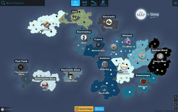
Peter's "Map of Sleep"
Along with designing, collaborating, and/or managing dozens of features for mappable, I also managed user testing and validation. We had extensive analytics support instrumented in the app, but we had also built a lot of interactions based on our assumptions. The first 2-3 years, in fact, were "agile" only to the extent that we de-risked technical choices, step by step, and focused on our primary stakeholder: Will Wright.
To add more validation, we started bringing in testers, and also hired an outside user-tester to help us develop persona.
We gave the personal aspirational names, like Tourist, Architect, Librarian...
These we felt reflected the modes of playful interaction we would target.
These we felt reflected the modes of playful interaction we would target.

We also worked to make the web version mobile-friendly, at the same time as we started on the iOS version.
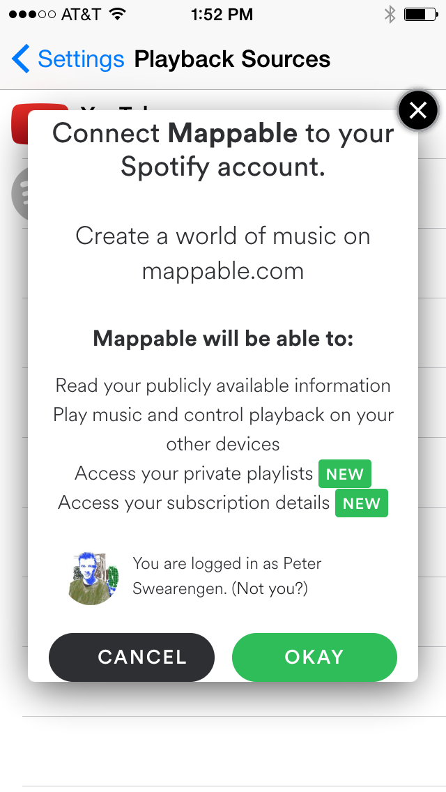
For the mobile UX to make sense, we felt it was essential to start by having users connect to whatever source of music they were already using. iTunes support came by default with iOS. More complex, and key to our strategy of supporting all platforms, was support for Spotify, and later, YouTube.
Ambitious to reach UX-parity with the mobile version, and prove our hypothesis, that users would enjoy discovery and consuption on mobile, and do most of their curation and personalization using the Web version, we began adding as many features as we could to the iOS app.
to be continued...